Plan a: women united
summertime
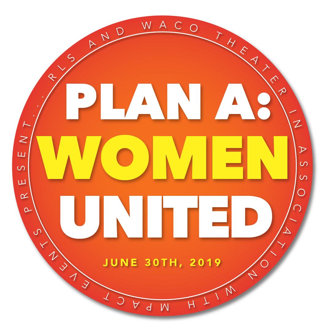
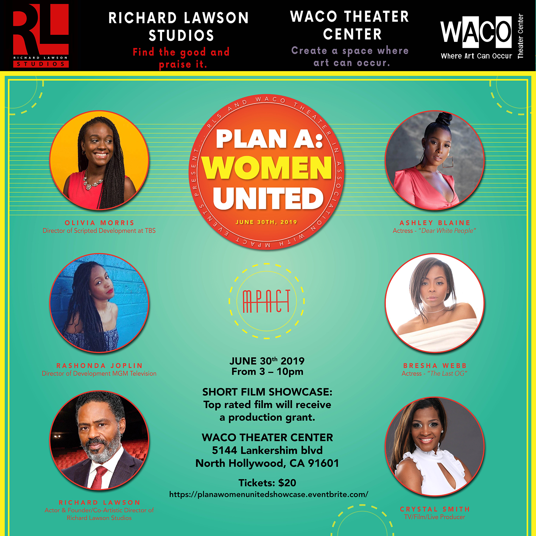
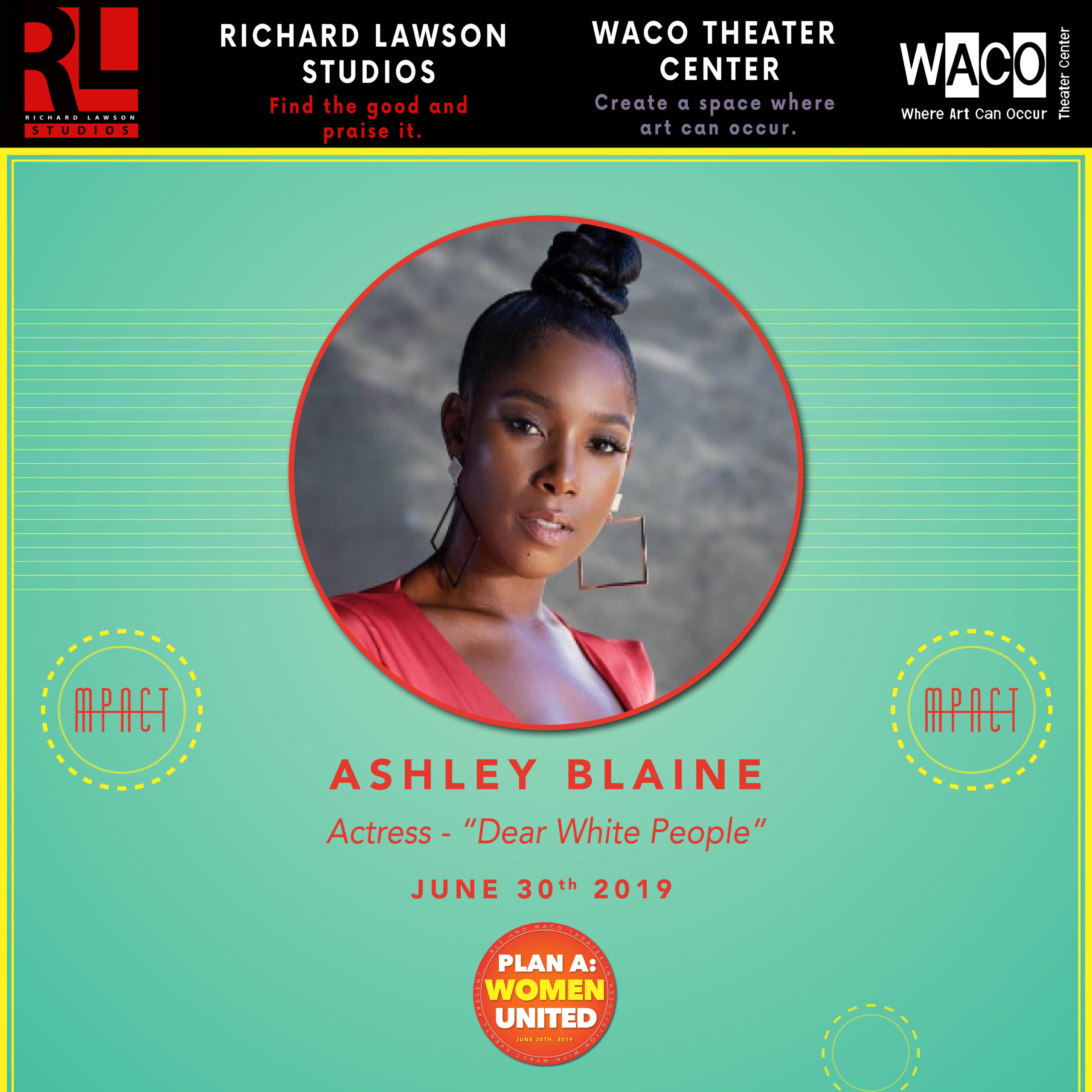
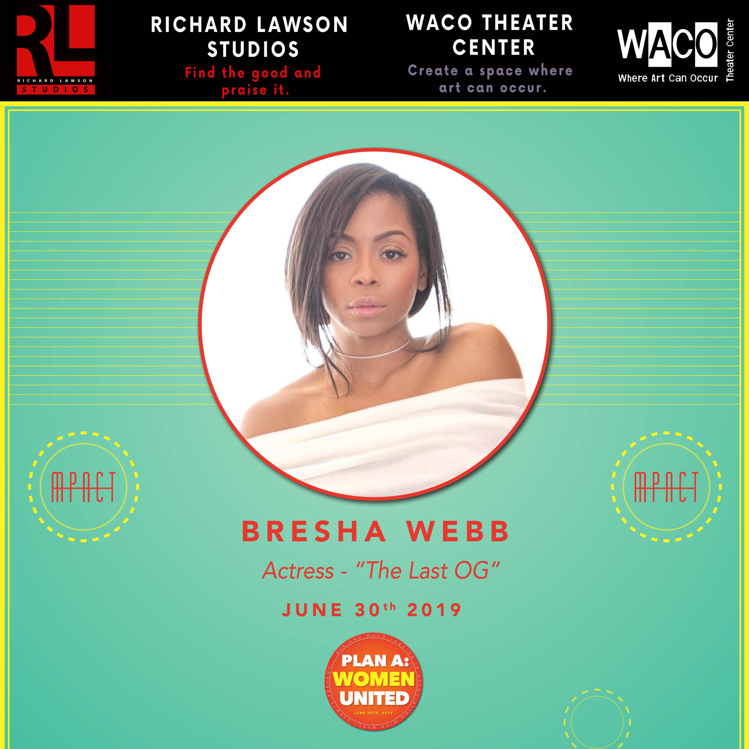
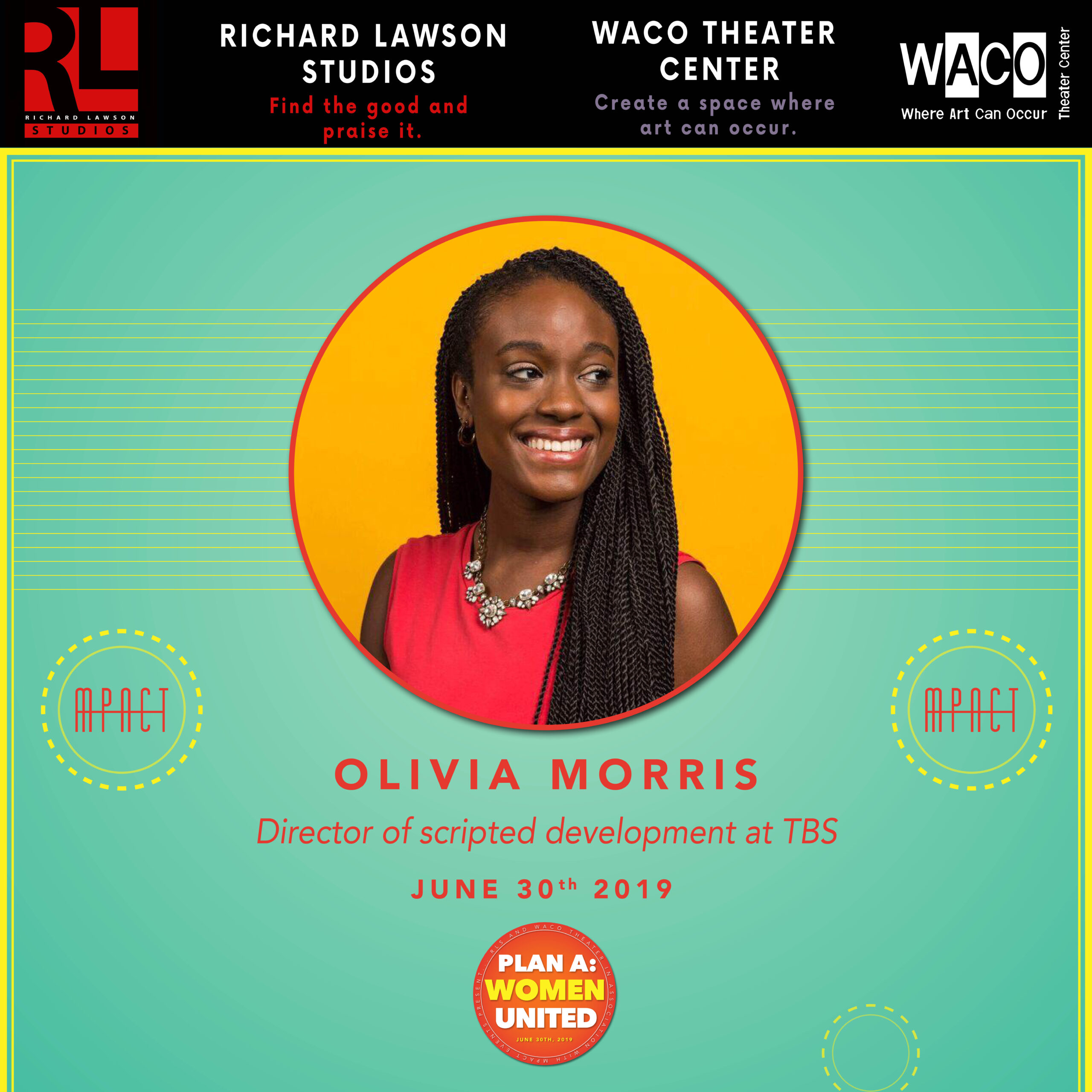
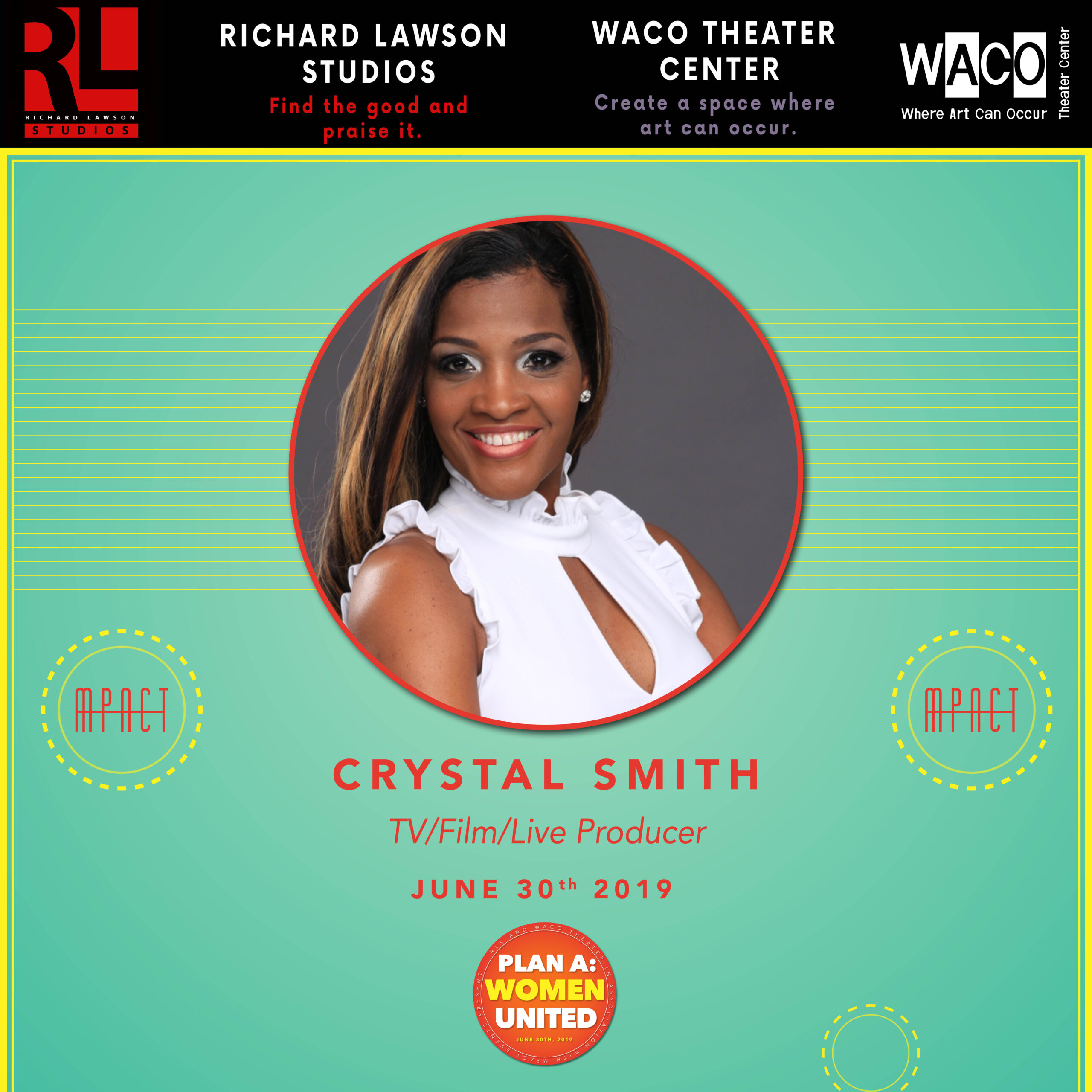
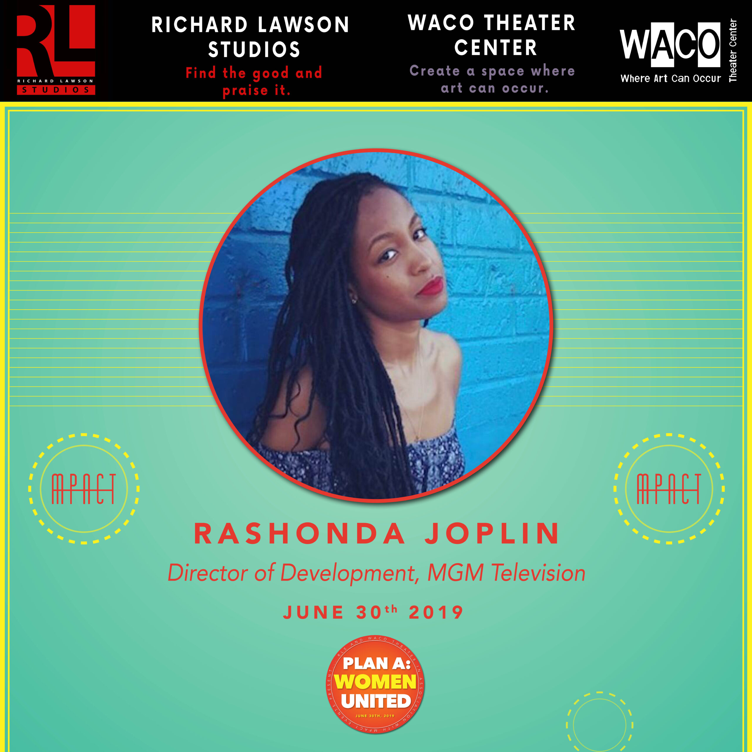
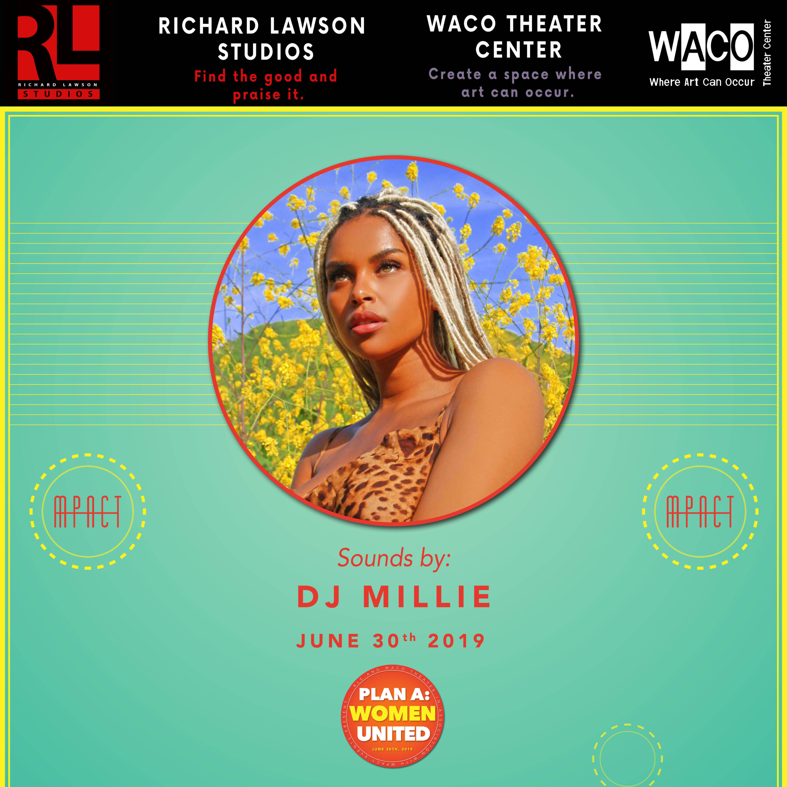
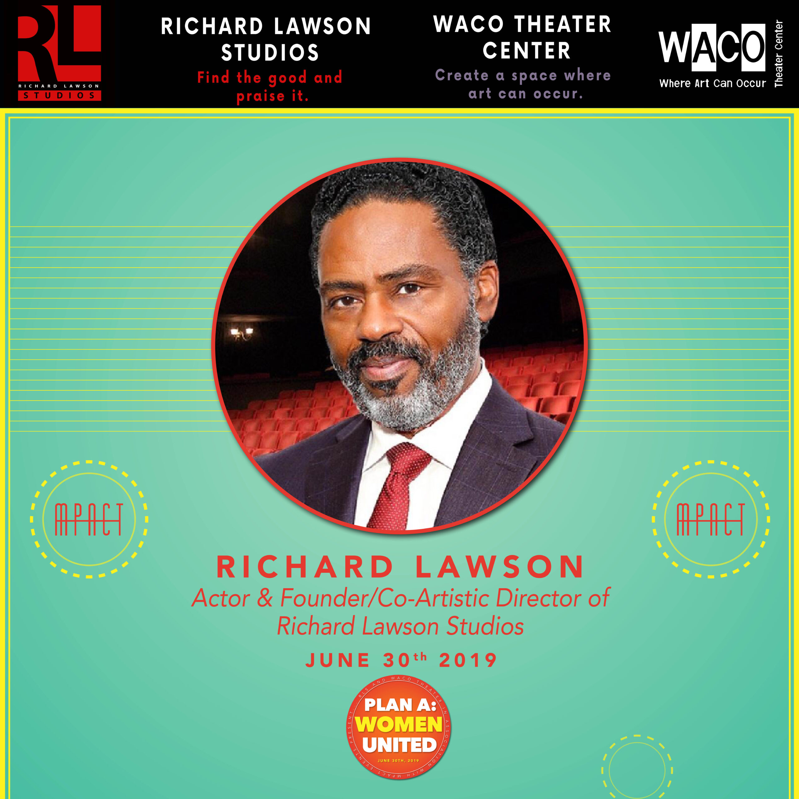
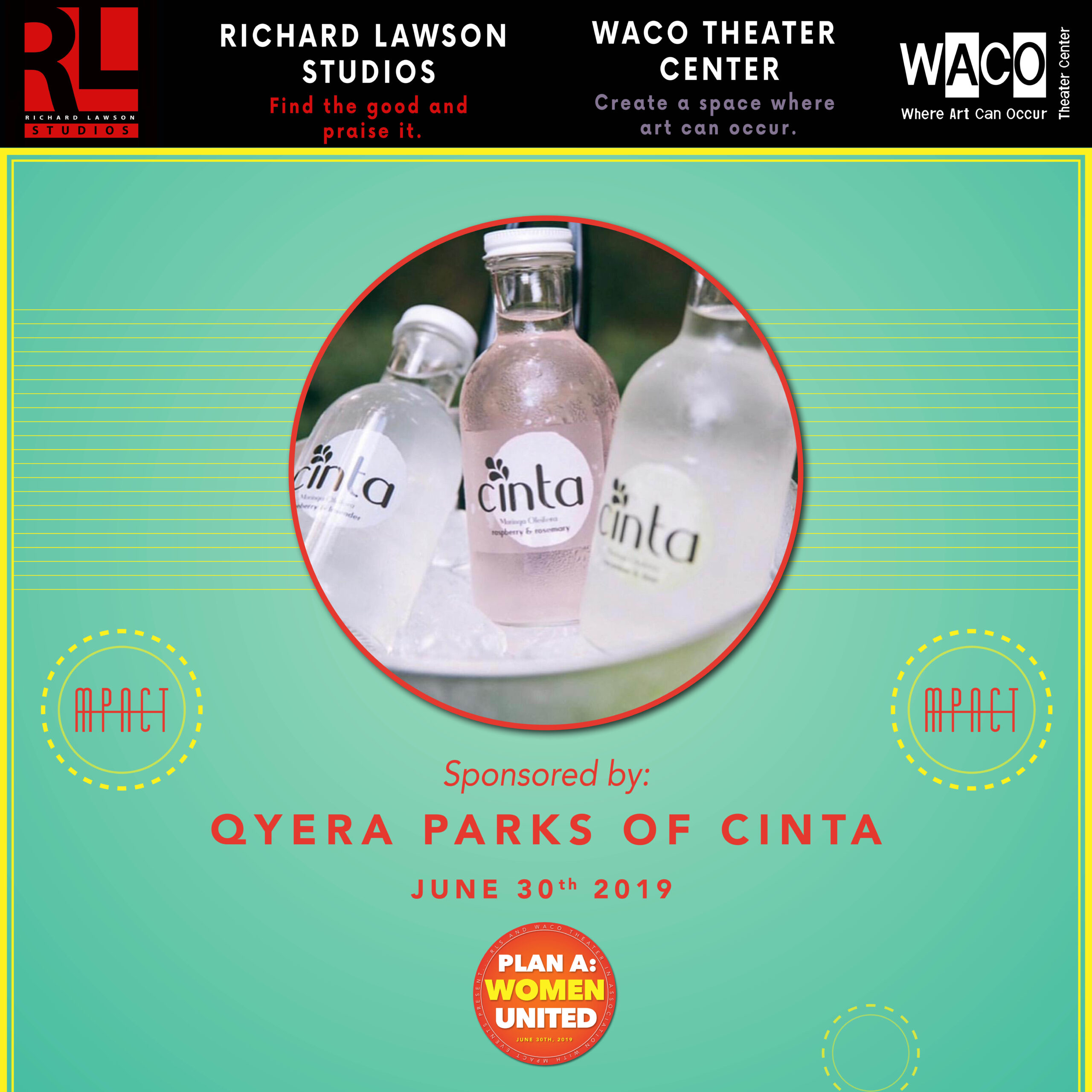
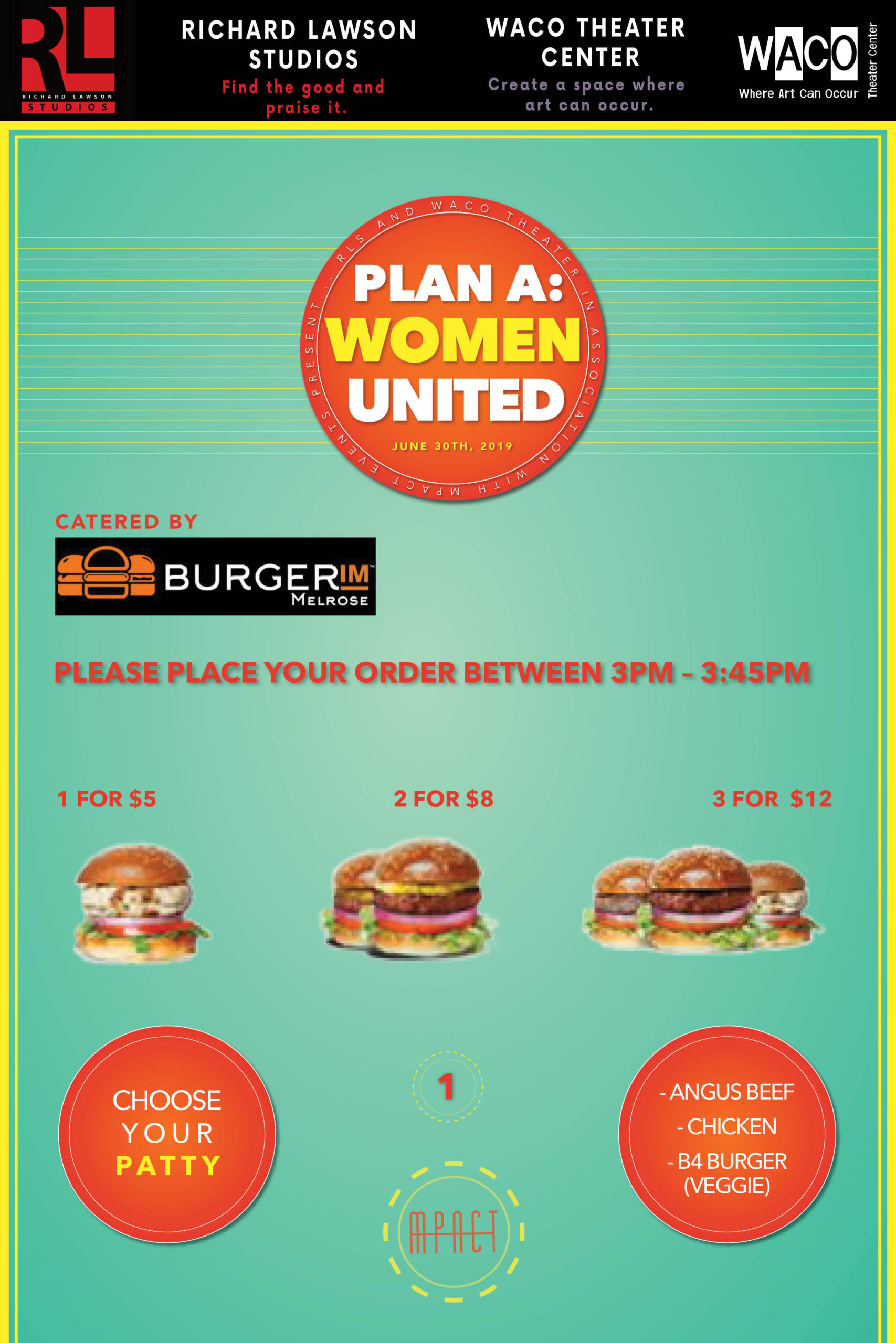
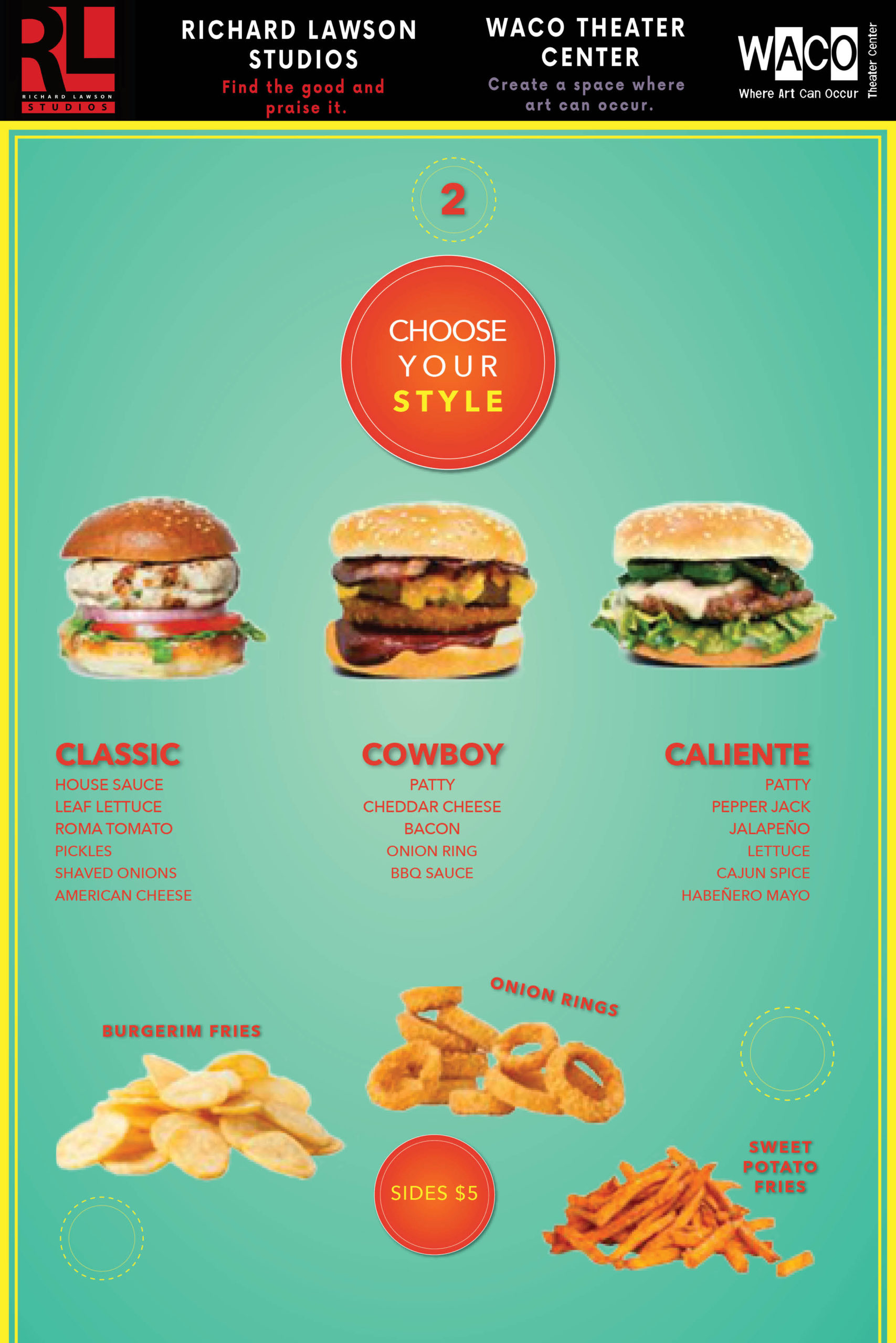
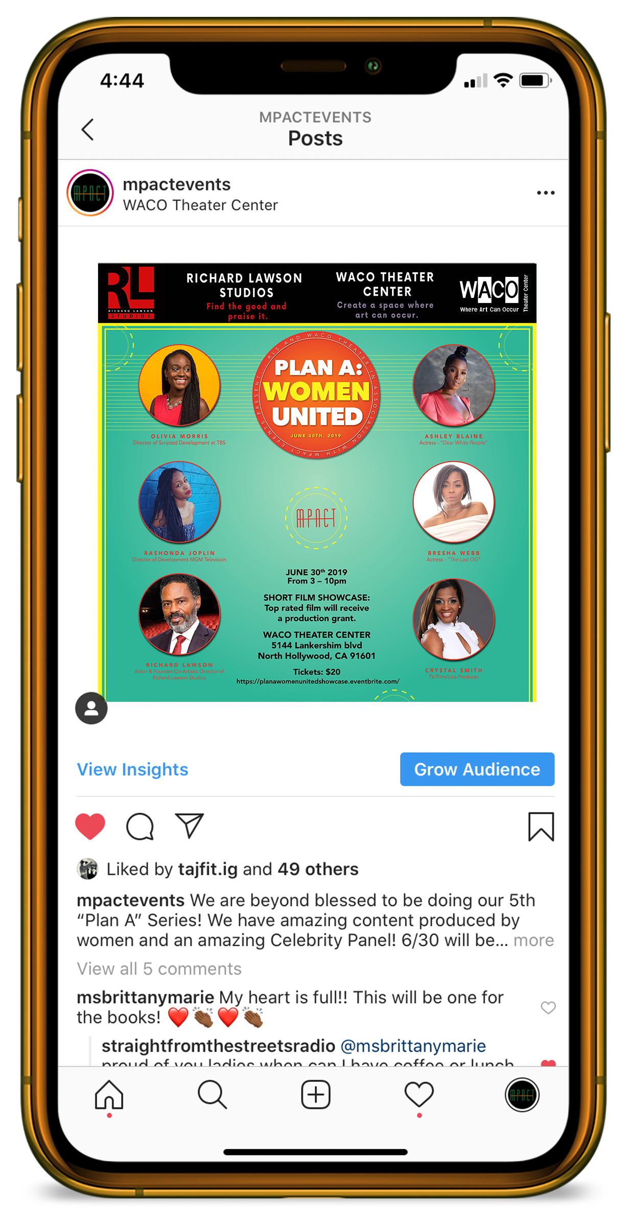
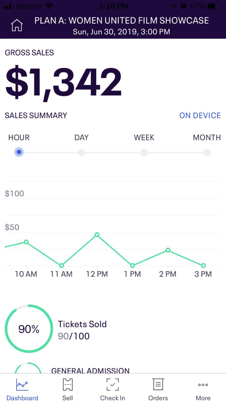
Plan A Women United, held at Richard Lawson Studios is the successor to Plan A Women Empowered. With the success of the previous showcase, MPACT Entertainment and Events had to do it again! This time for the summer!!!
client
MPACT Entertainment AND Events
services
Social Media Email Design
industry
Entertainment Hospitality
getting united
The title graphic, “Women United,” gave me the idea to create a design using the word “United,” thinking of the USA. I chose a slim font for the title, giving the design a congressional look while maintaining the feminine, bright summer aesthetic. I wanted to take all the information and put it onto the circle, sponsoring and creating the event, the date, etc. Including dotted outline neon yellow design elements outside the ellipse; something fun.
Using colors typically found in designs that present a summer aesthetic (bright, primaries), I altered a few colors to incorporate the neon aspect. I used circles to represent something fun, adding drop shadows and colored borders.
make it hot!
The design system of Plan A Women Empowered, with its bold font and color choice, was a great design system to follow. This time of year is bright, colorful, and hot. And neon is bright only at night. So how can one combine a day and night to create a cohesive campaign? And what about the title graphic? How should that look?
Over the design process, we played with many ideas about color choices, such as orange and pink. We initially decided to go with two interchangeably (orange for the menu and pink for everything else), but then thought it was best to choose just one of the colors.
Using colors typically found in designs that present a summer aesthetic (bright, primaries), I altered a few colors to incorporate the neon aspect. I used circles to represent something fun, adding drop shadows and colored borders.